Industry
Hospitality
Year
2020
Branding Deliverables
Digital Rebranding
Brand Guidelines
Packaging Design
Social media and Omnichannel assets
Product Design & Strategy Deliverables
Digital Rebranding
Brand Guidelines
Packaging Design
Social media and Omnichannel assets
Brief
A revitalized Brand Experience for a lighting international brand
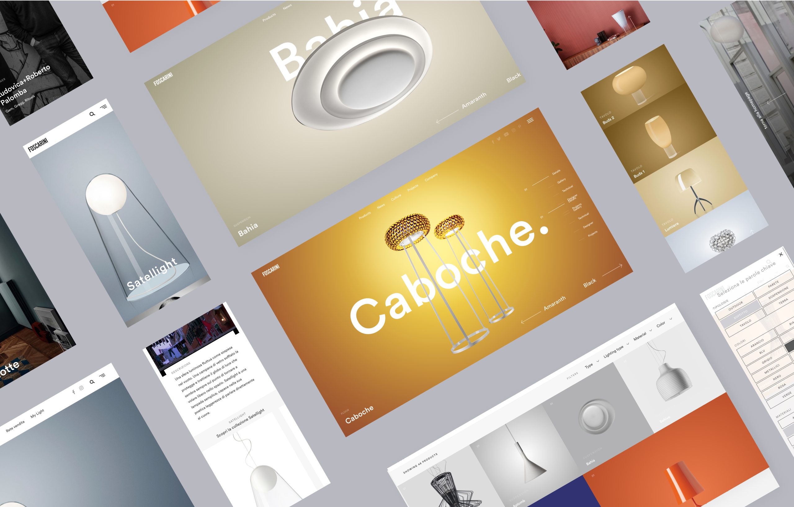
At Competence&Digital, we were tasked with designing and developing a new digital ecosystem for Foscarini.
This included everything from strategy and branding to e-commerce, in order to showcase Foscarini's vast catalog of products and editorial content in an engaging and functional way. The ultimate goal was to increase in-store appointments at the flagship stores.
Solution
Foscarini, founded in 1981 in Murano, is one of the world's leading lighting brands, focused on bridging the artisan tradition and collaborating with designers from all over the world.
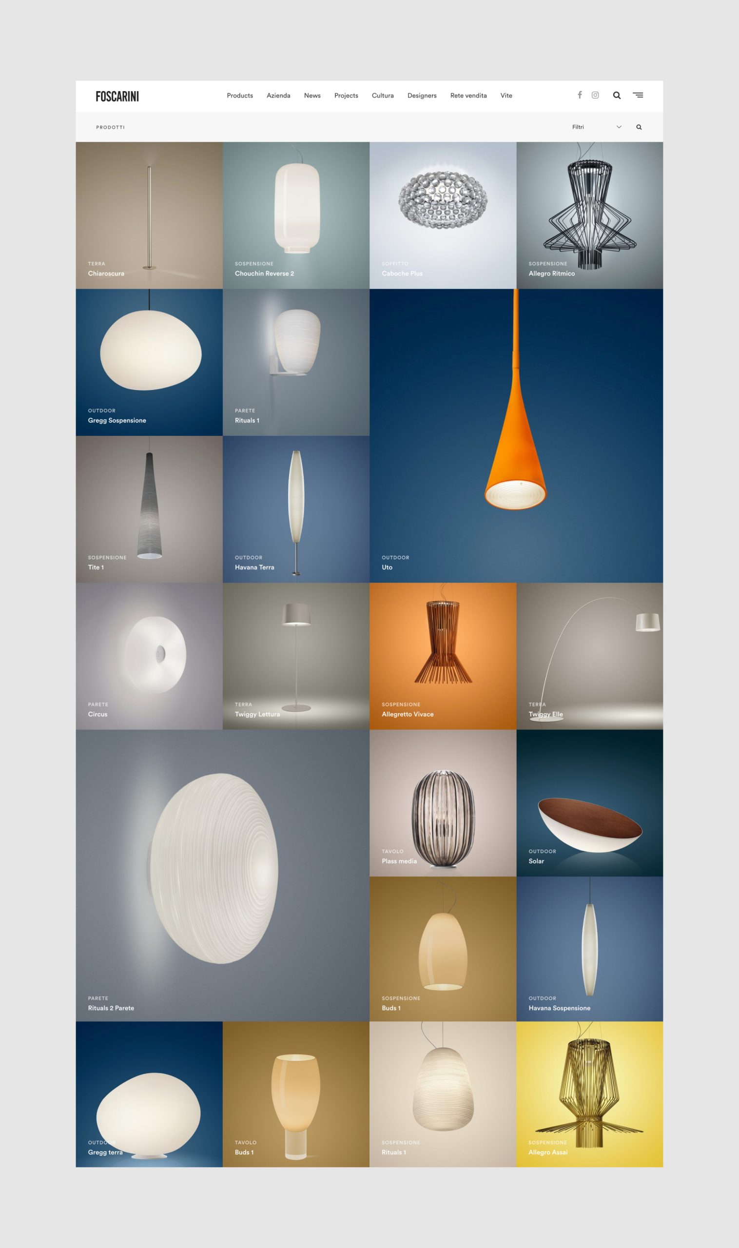
One of the main challenges we faced was the vast range of products offered by Foscarini. We needed to find a way to showcase the variety of designs without overwhelming the user. Additionally, we needed to create a website that was easy to navigate and visually engaging.
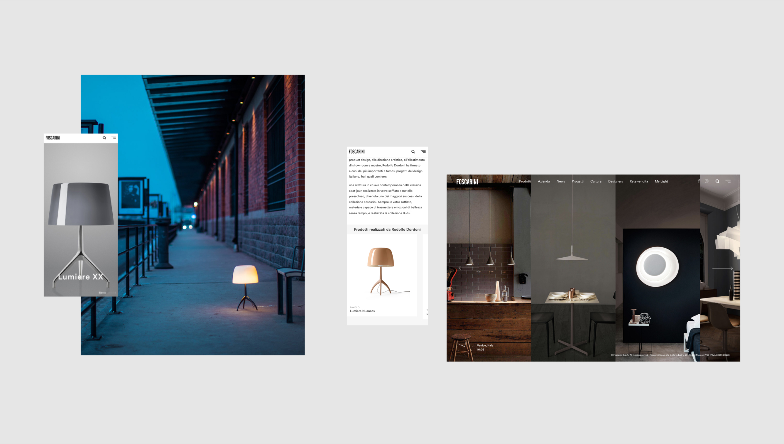
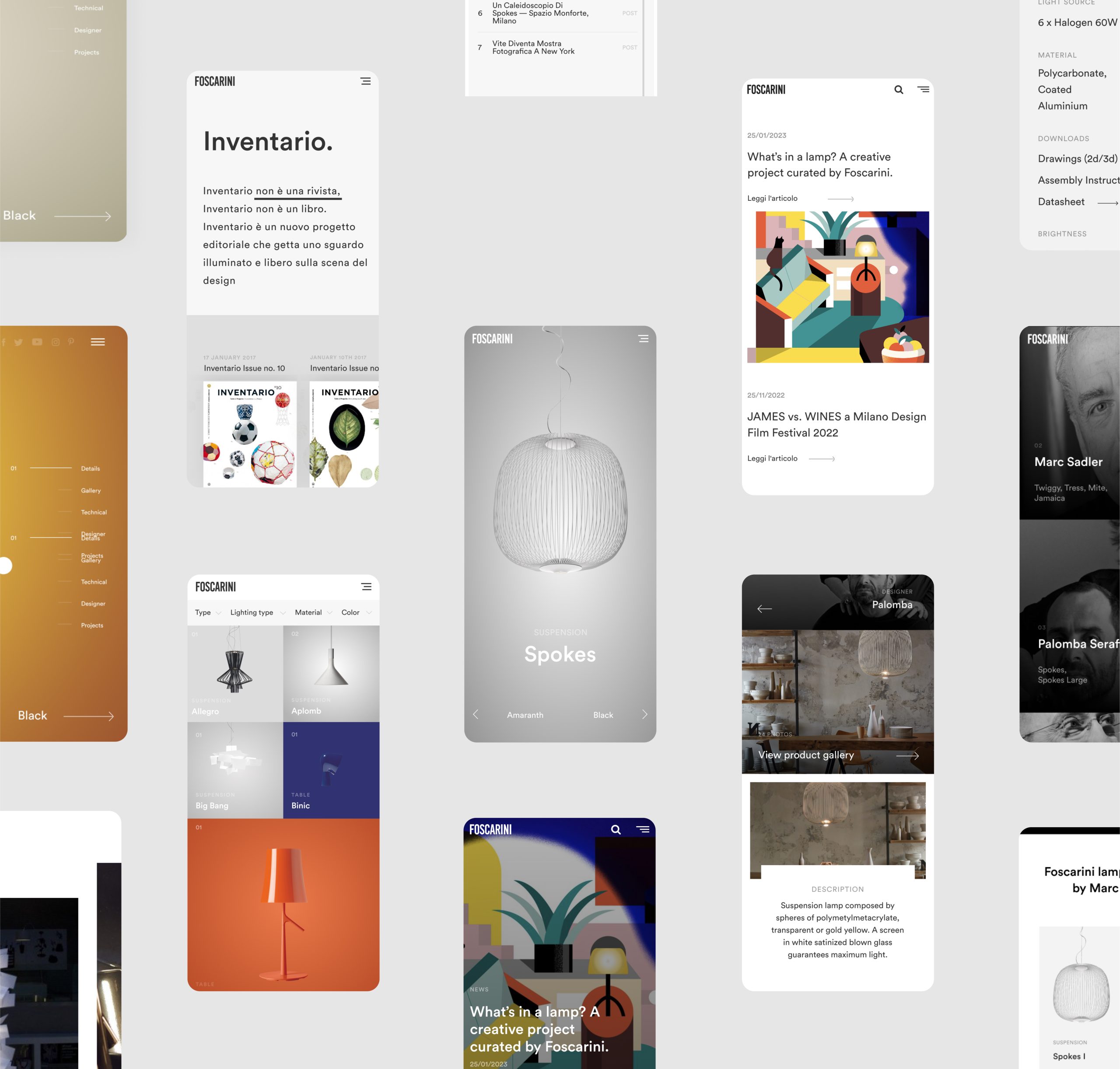
Identifying the opportunities coming from research and field studies
Italian furniture and lighting exports have surged with a 53.7% increase in France, the US ($573.5 million, +73.7%), and Germany ($555.5 million, +32.8%) since 2016. Annual sales have increased by 51.7%, with a strong recovery in the Italian market (+67.3%).
We analyzed luxury consumer behaviour online and recommended changes to Foscarini's digital strategy, including a user-friendly website, engaging social media content, and a mobile app for easy browsing and purchasing.
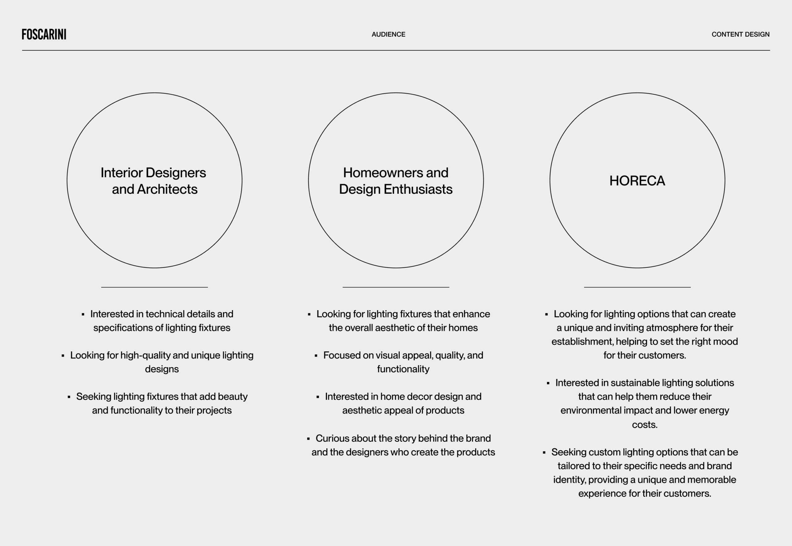
Understanding Foscarini's Diverse Audience
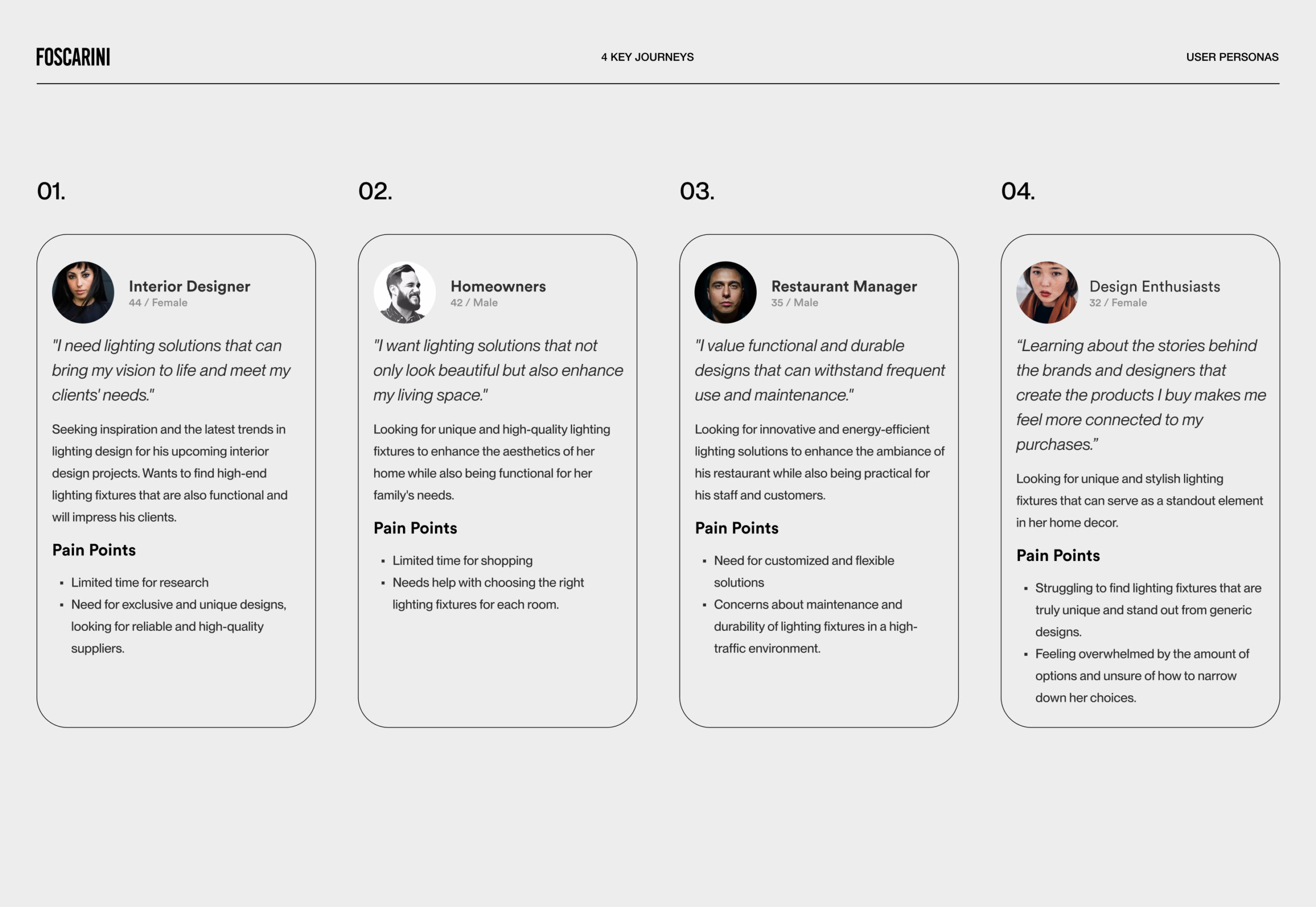
Designing a successful website requires a deep understanding of the target audience. For Foscarini.it, we conducted research and created four personas that represent the primary user groups of the website: architects and interior designers, homeowners and design enthusiasts, gift shoppers, and HORECA businesses.
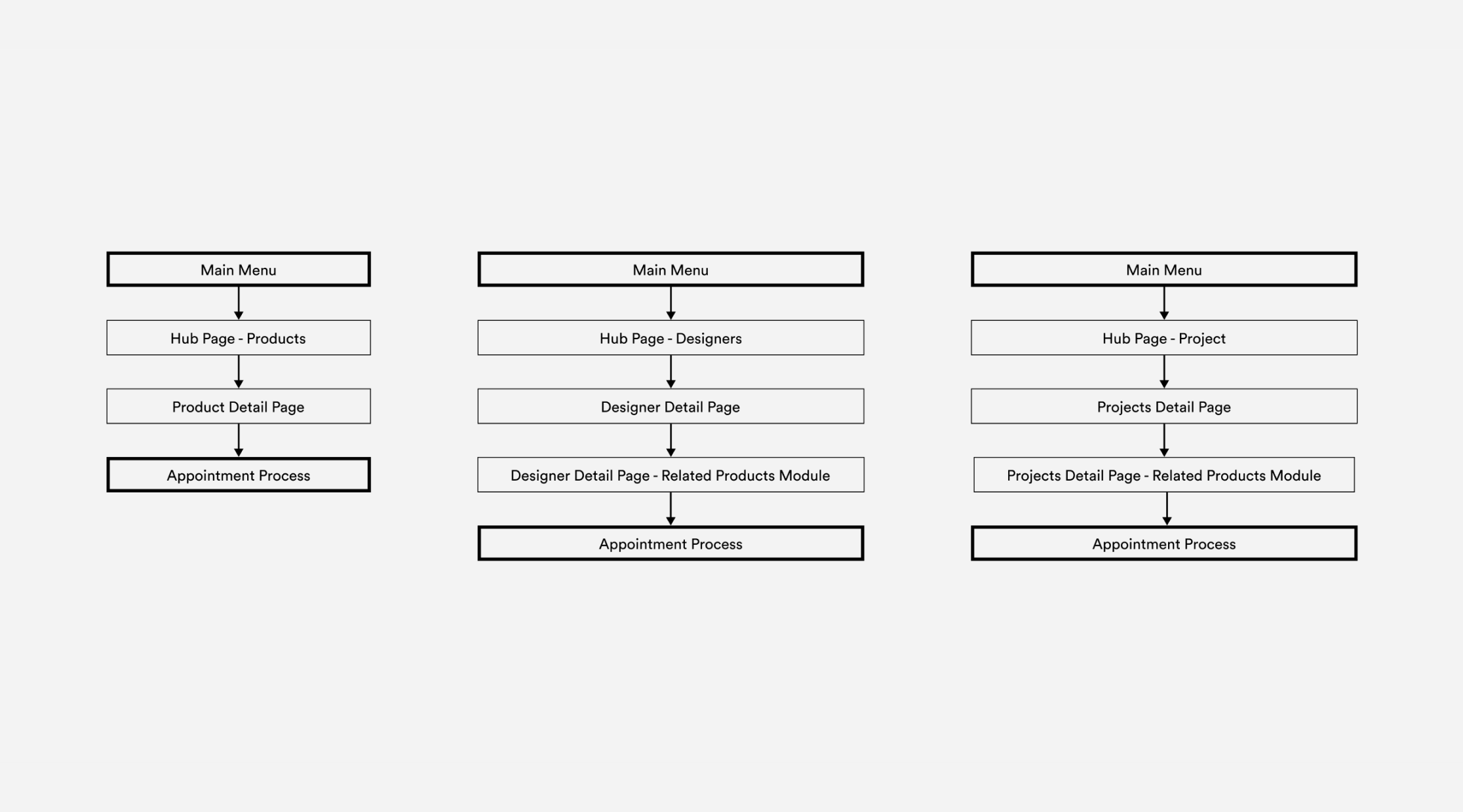
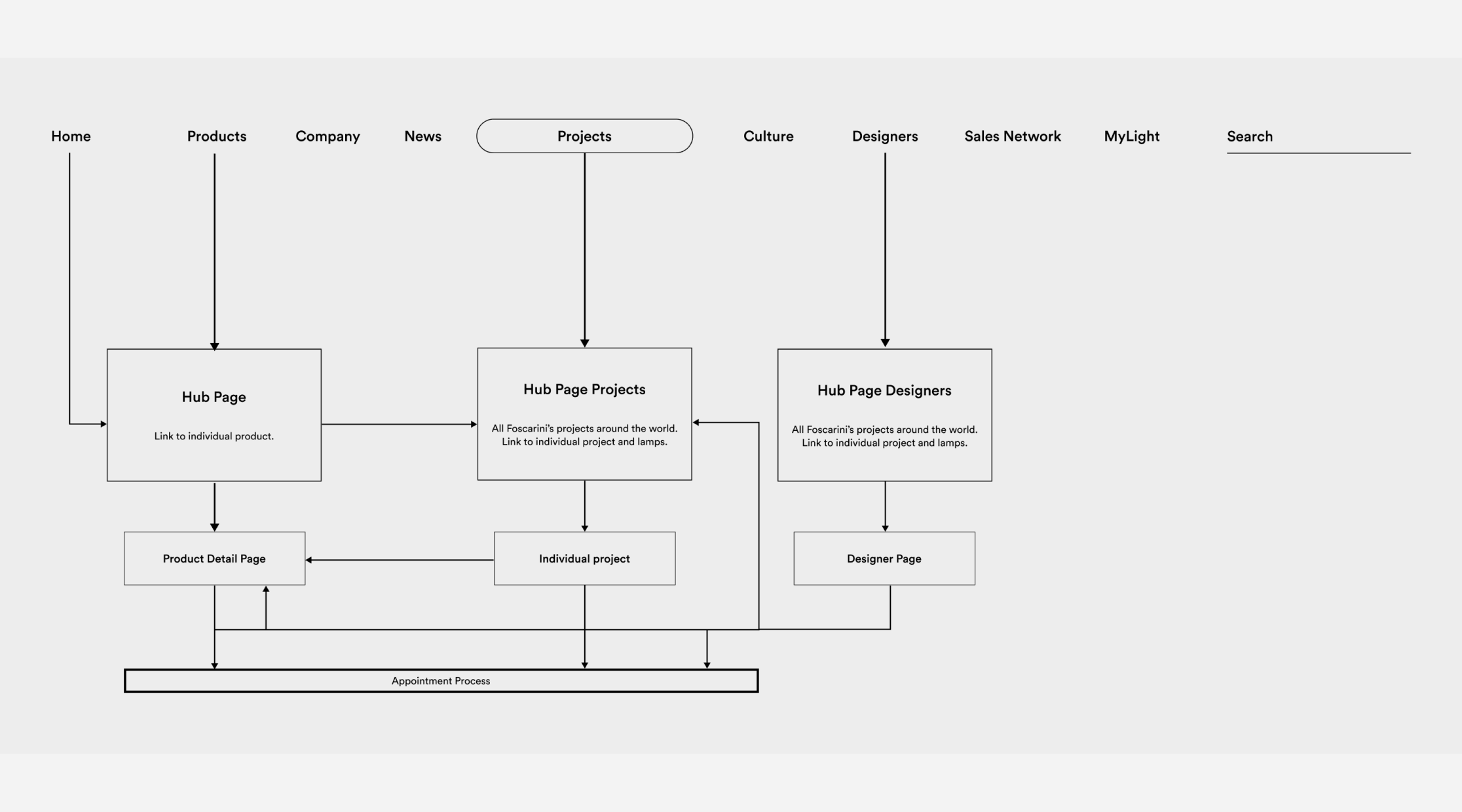
Optimized navigation system in order to improve progressive disclosure of technical information
Foscarini's improved navigation system offers a tailored experience for all users. Unique personas based on individual needs, preferences, and pain points were created to present a range of cultural initiatives in a streamlined curation strategy. This approach prioritizes storytelling and enhances the user's journey.
Elevating User Experience through Storytelling
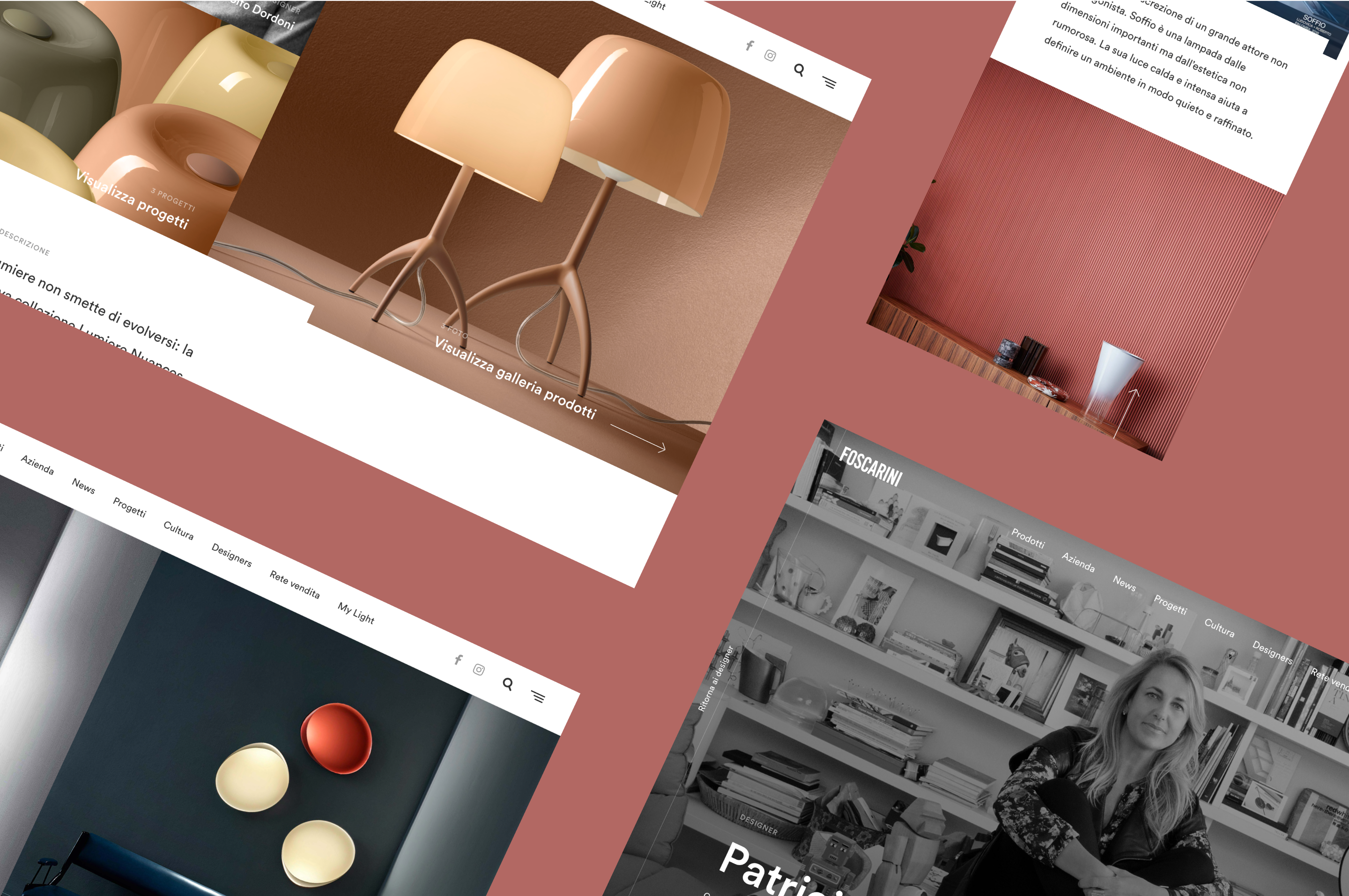
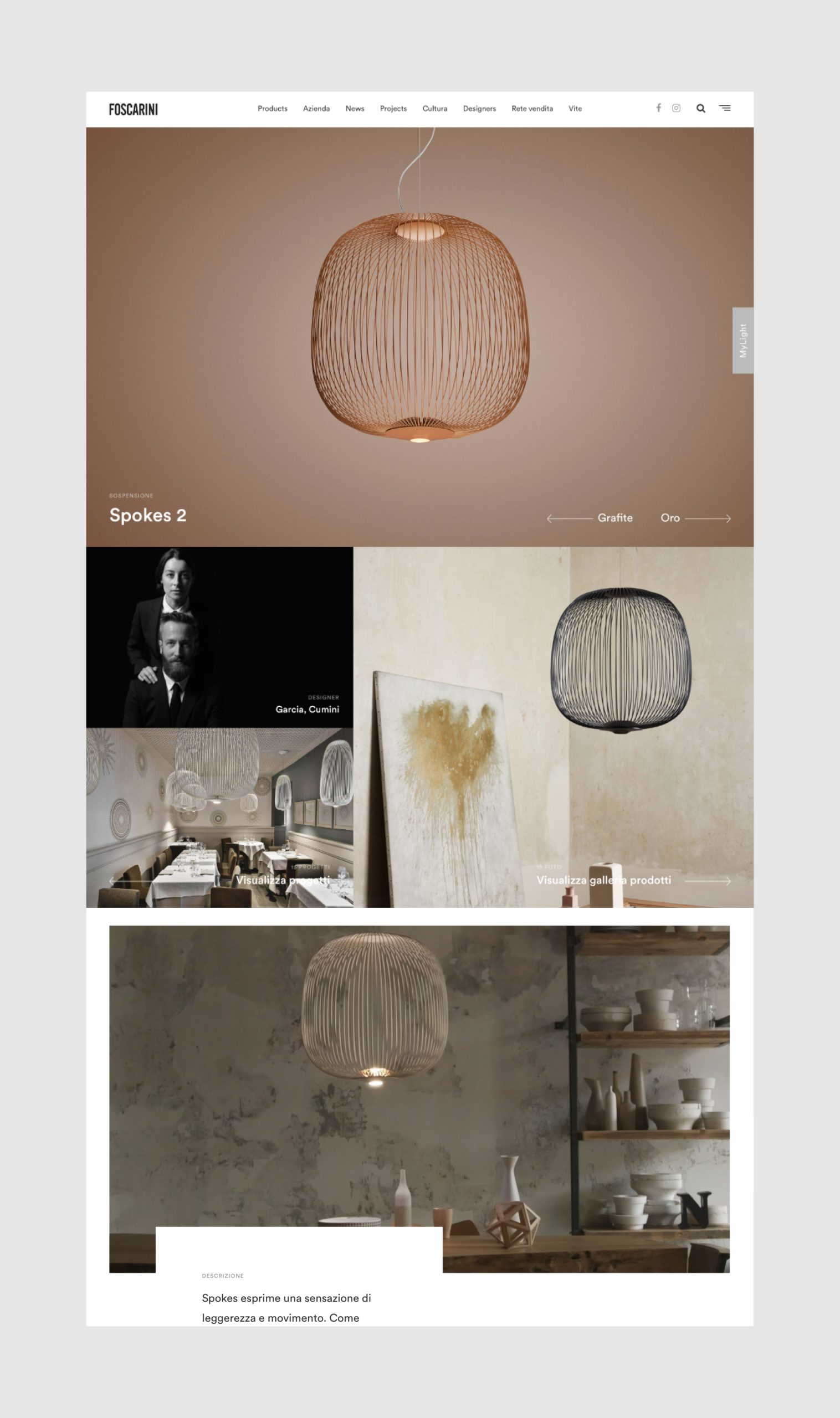
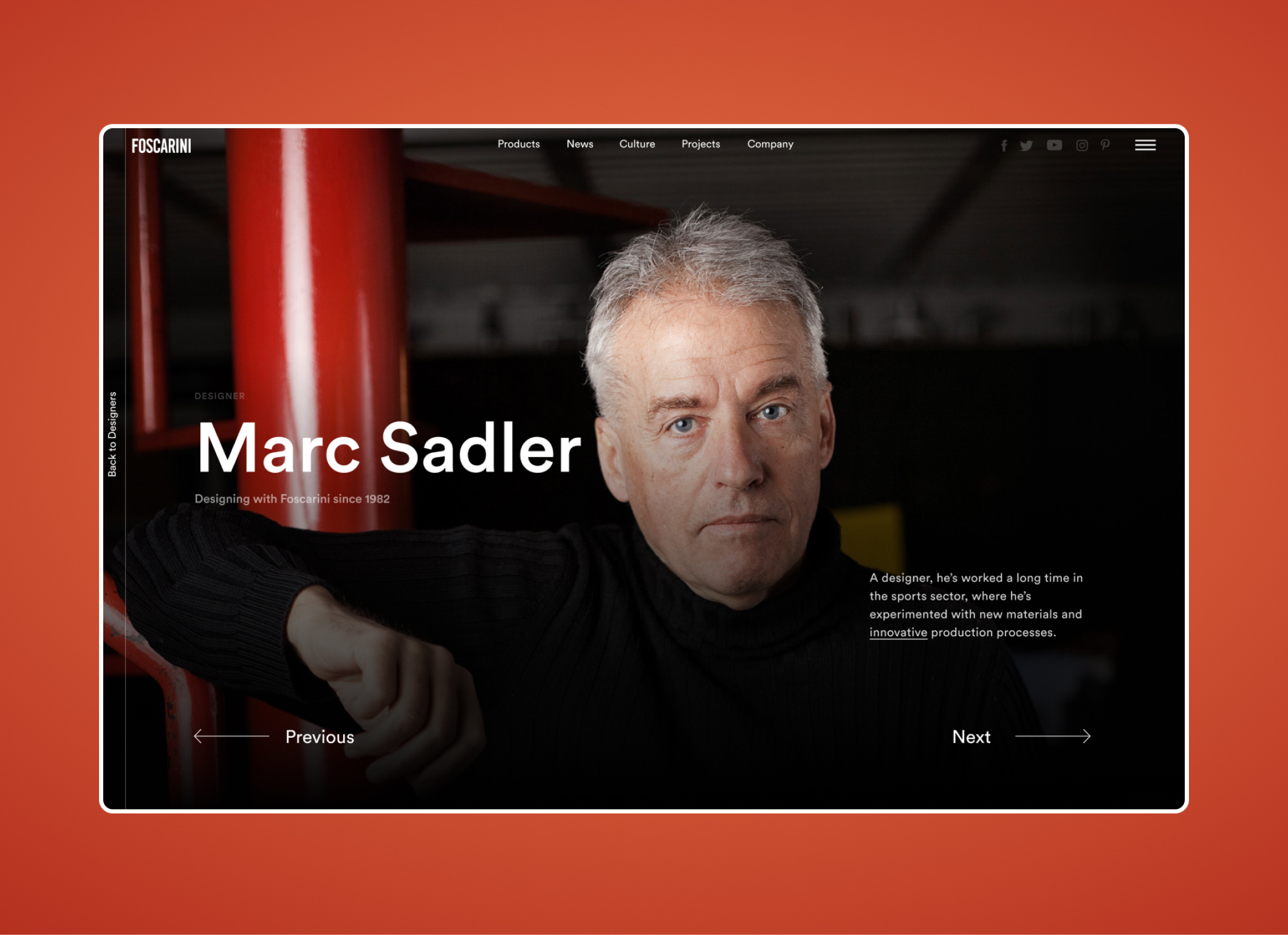
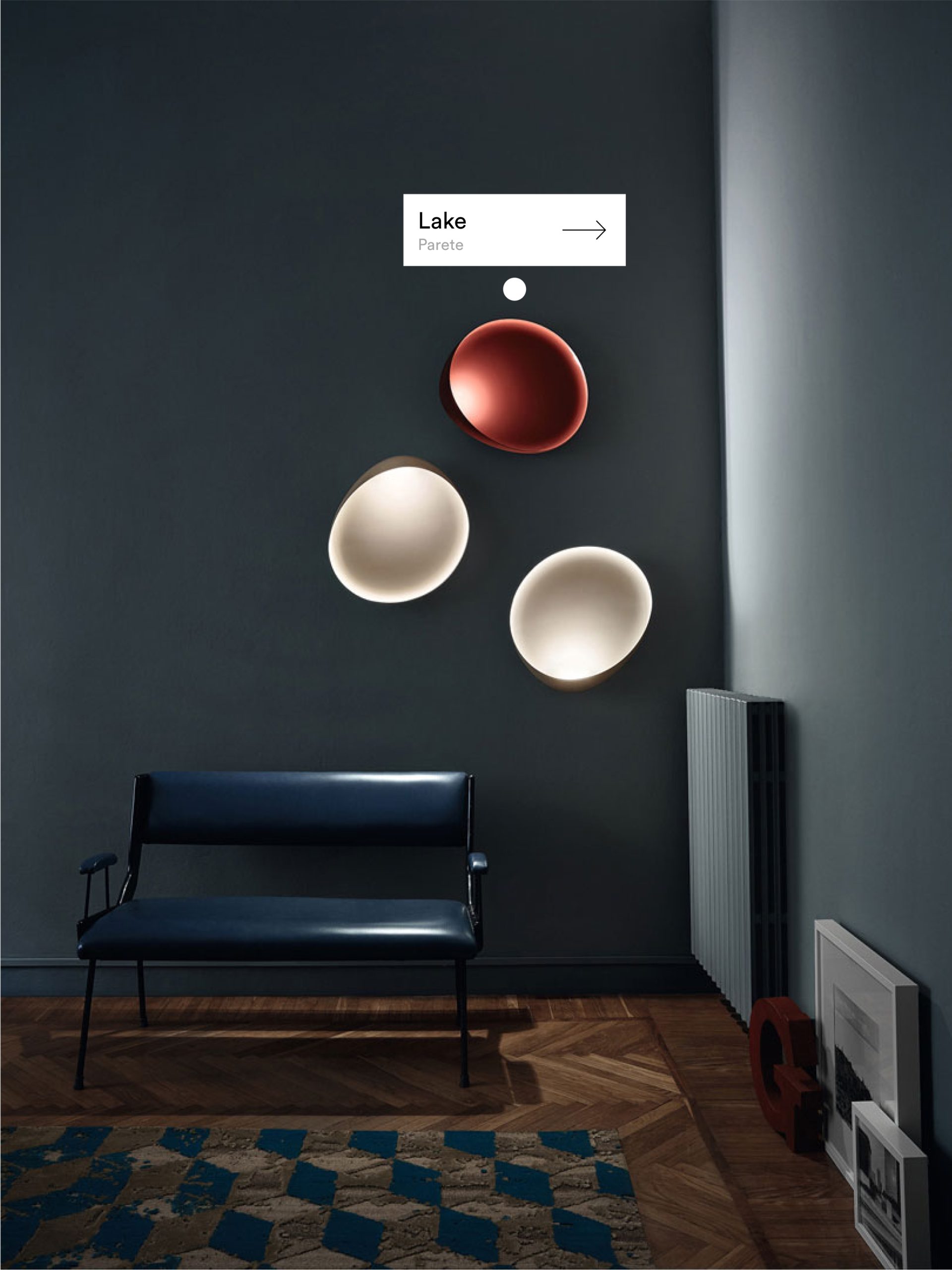
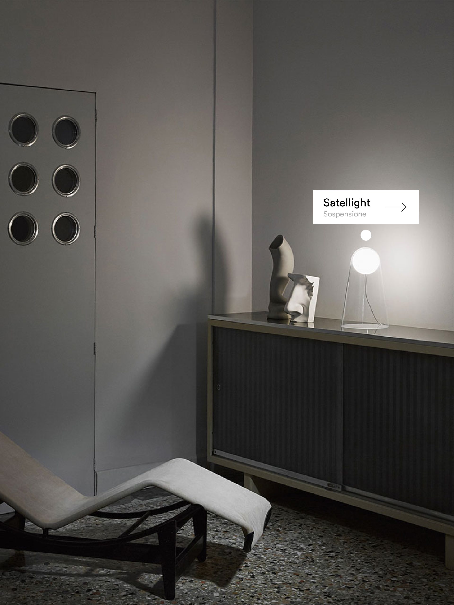
Foscarini's site redesign prioritizes an immersive user experience, combining captivating visuals and a minimalist design. Departing from traditional e-commerce, it tells the unique stories behind each product and designer, creating a rich, engaging narrative.
The focus on premium product presentation, with animations and lifestyle content, aims to drive conversions and justify the brand's higher price point. The result is a modern, user-centric platform that seamlessly integrates brand storytelling with product exploration.
Addressing the Needs of Different User Groups
Developing a user-centric website that accommodates a variety of user preferences
Foscarini's Strategy for diverse user groups involves creating distinct landing pages and enhancing user experience by offering personalized and relevant content for each audience.
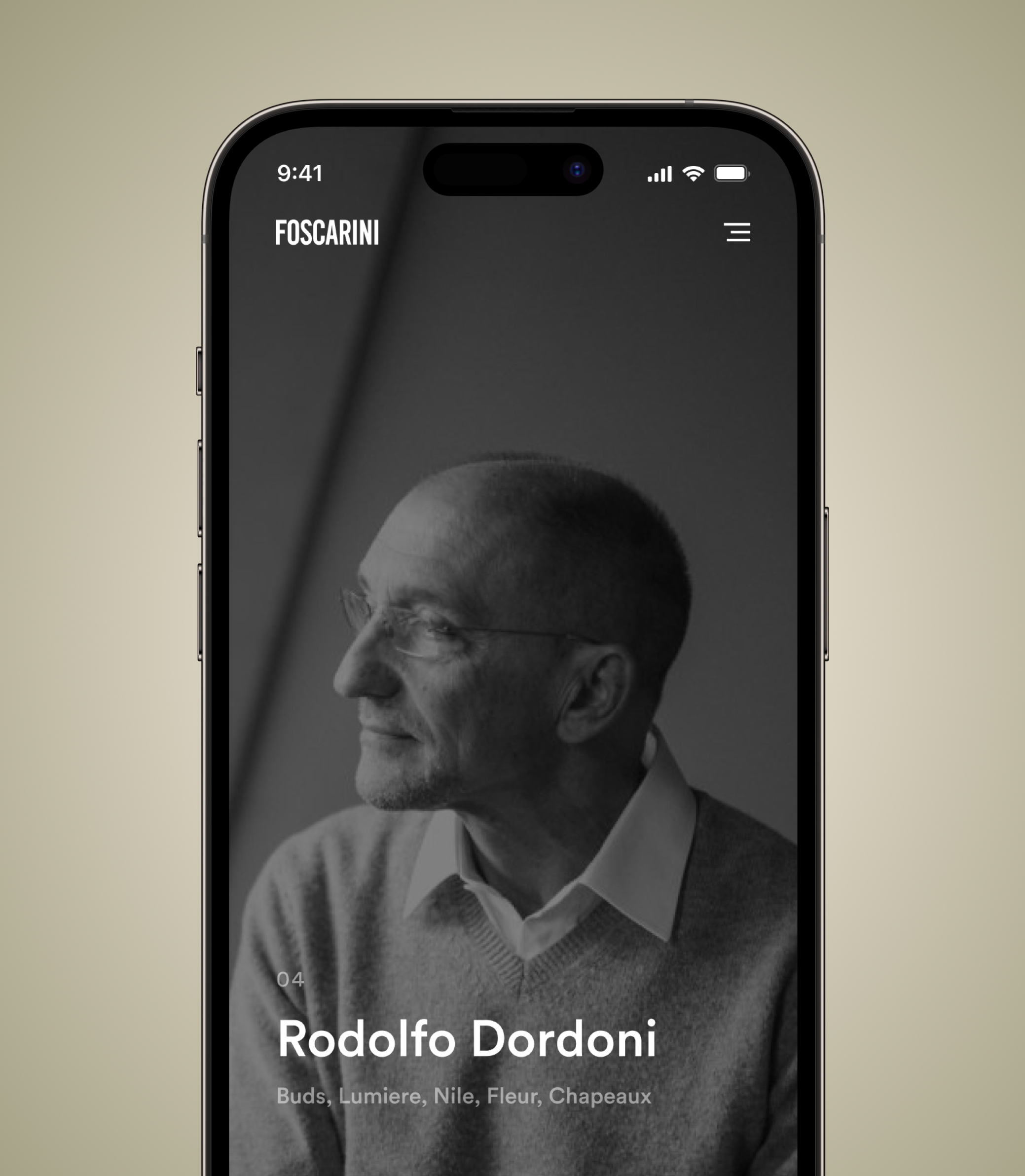
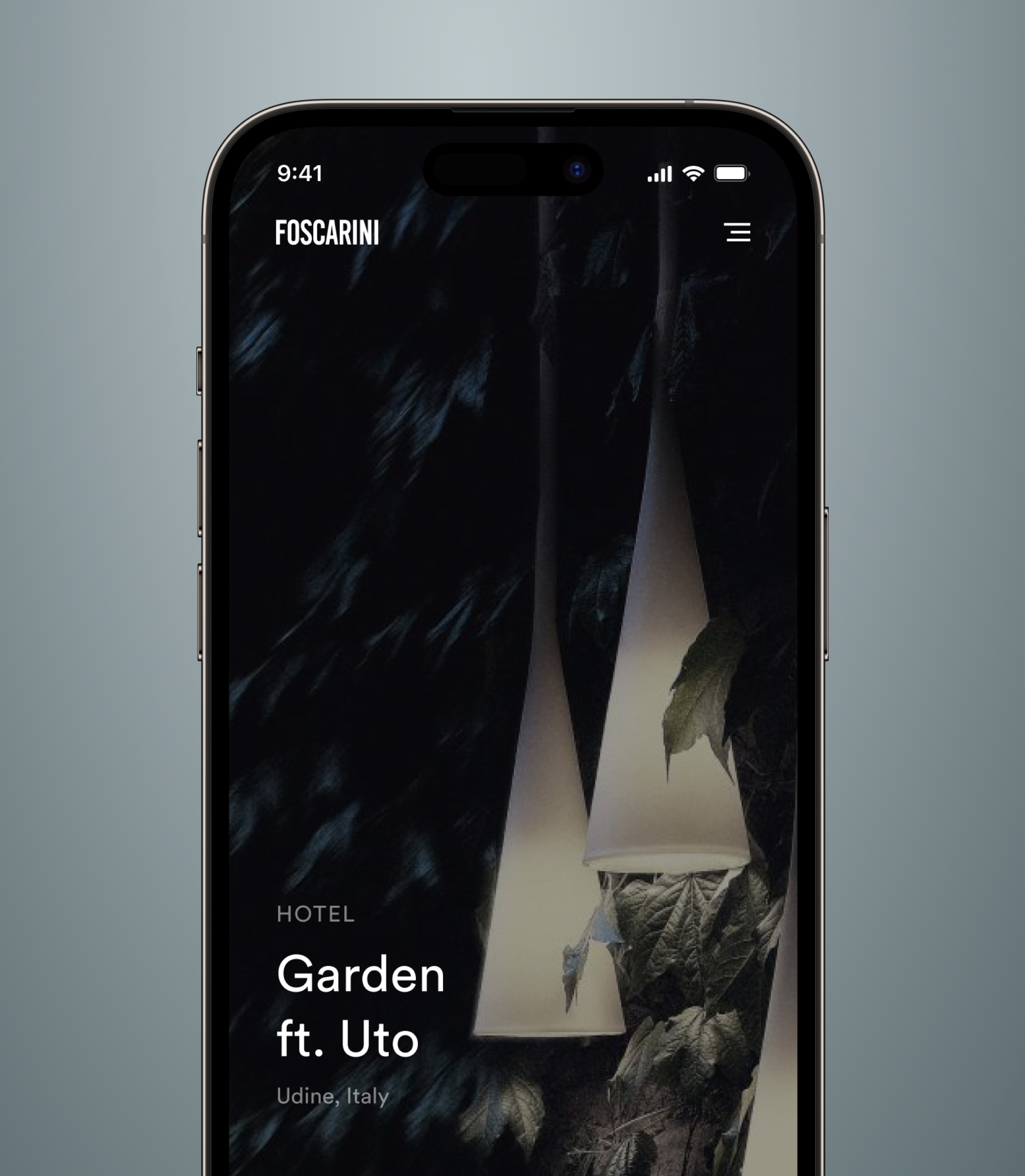
Personalizing the User Experience for Architects, Interior Designers, and Homeowners on Foscarini's Website
Foscarini can showcase its products' technical specifications and performance data, demonstrating the suitability of its products for large-scale commercial projects.
Interior designers, on the other hand, may be interested in the aesthetic qualities of the lighting and how it can be used to create unique and stylish interiors.
Homeowners may be looking for lighting solutions that offer both functionality and design appeal.
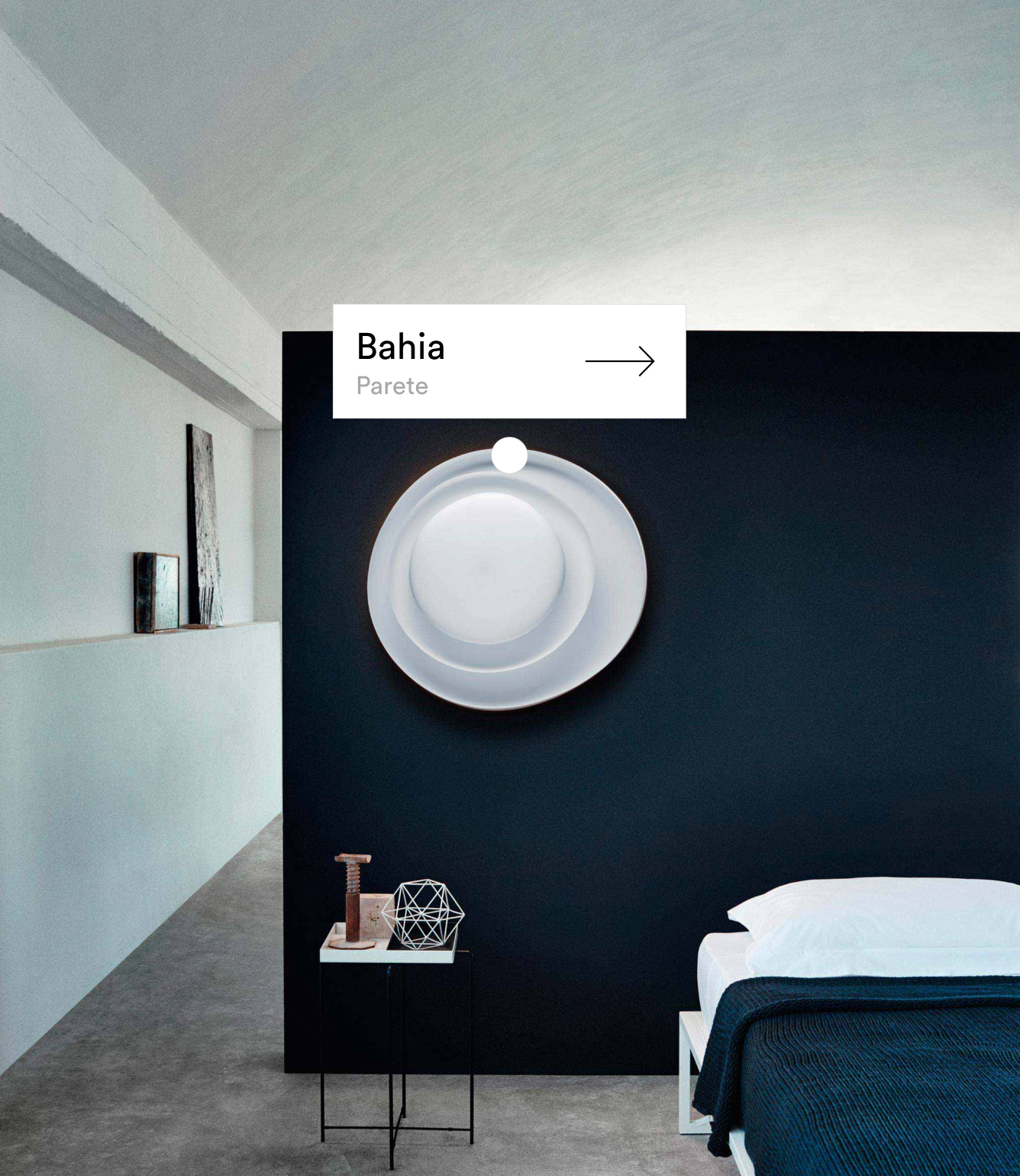
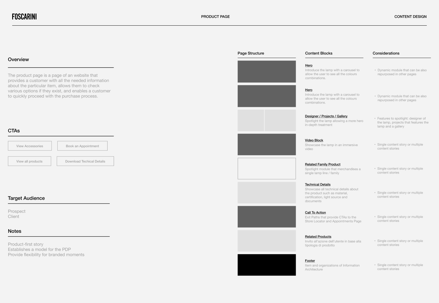
Product Page
To maintain the simplicity of our design, we needed a powerful filtration tool that could optimize a complex product catalog.
The end result was a floating, contextually aware action button that becomes the most prominent prompt on any page. This responsive UX pattern is designed for approachability and progression, and successfully helps users browse.
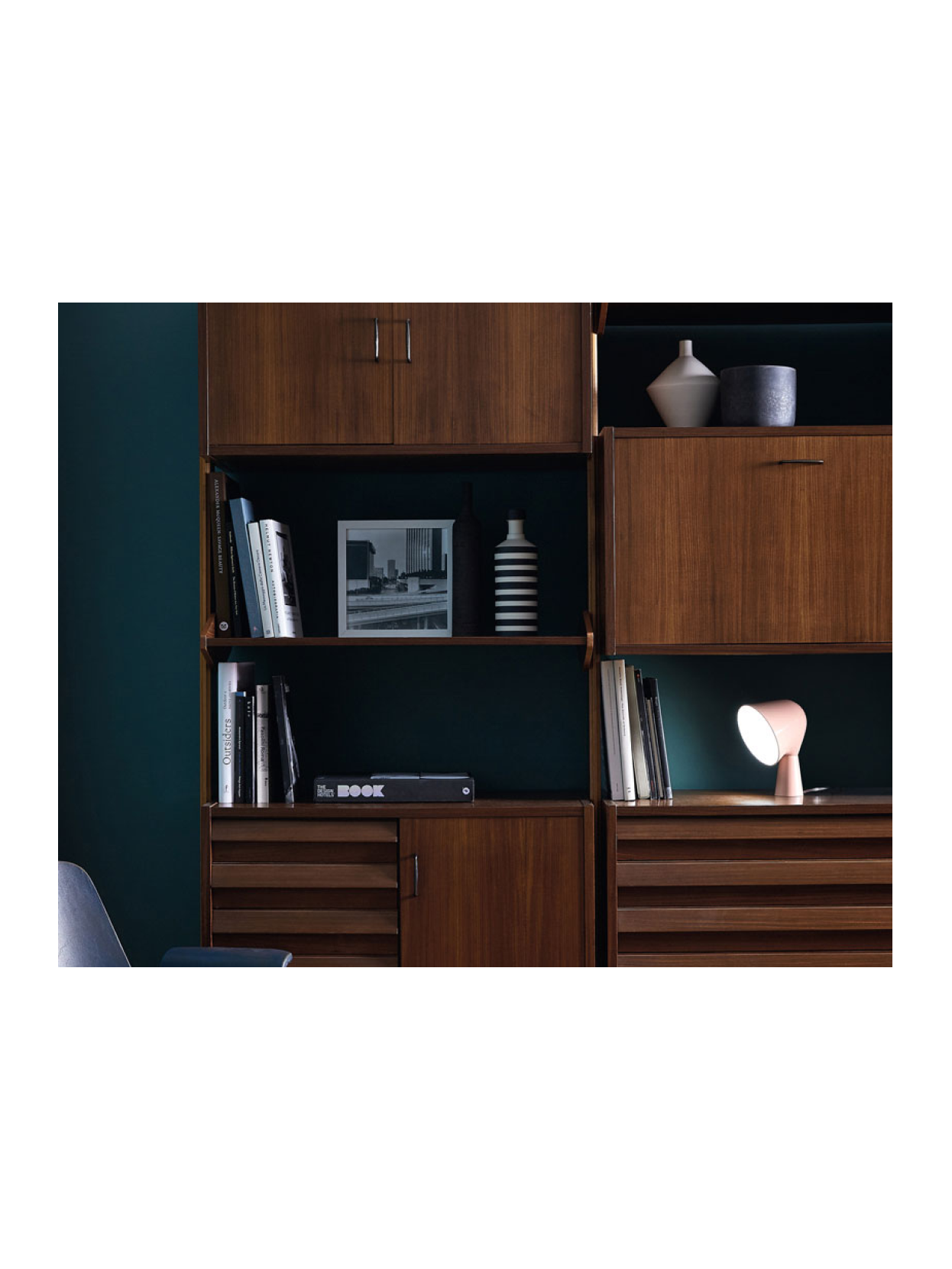
Streamlined Product Content Guidelines for Digital Excellence
Comprehensive product content guidelines have been developed to ensure the seamless maintenance of our system for photography, video, and written content by the Foscarini team in the future. These guidelines provide detailed instructions and standards for creating and managing product imagery, videos, and written descriptions.
By adhering to these guidelines, the Foscarini team can consistently maintain the quality and coherence of the brand's product content across all digital channels, enhancing the overall user experience and brand consistency.
Enhancing E-commerce Engagement and Checkout Experience
We've boosted conversion rates across all Foscarini markets by enhancing search functionality and streamlining the checkout process.
When products are out of stock, offering alternatives or showcasing them in-store can keep users engaged. For anticipated restocks, allowing users to place orders with extended delivery times maintains engagement. Clear instructions for booking appointments and offering flexibility for rescheduling or cancellations further enhance customer satisfaction.
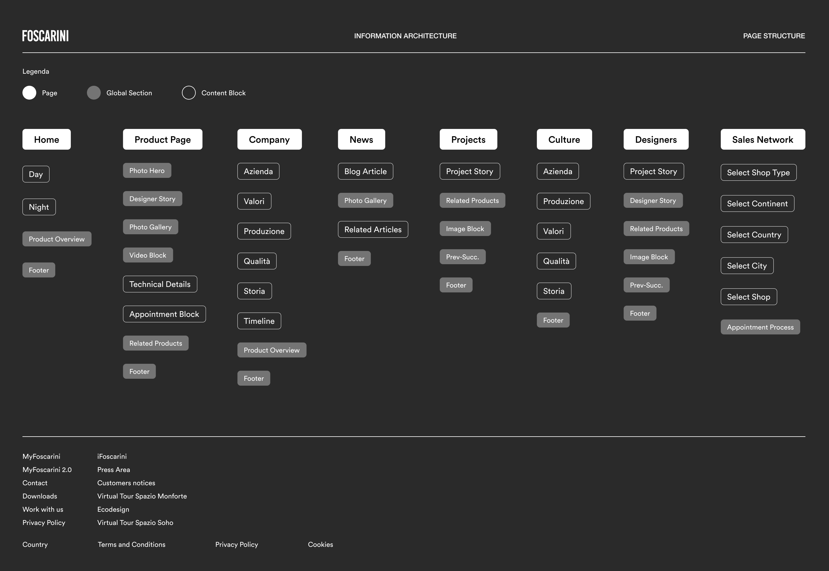
A Design System as a Product
Create a flexible modular design system, developed to enable the editorial team to easily and efficiently update the website.
I created a modern design system that reflects the brand's values and helps the editorial team update Foscarini's website with ease.
Our system is built on the foundation of a perfect balance between product innovation and purposeful design. It is modular, flexible, and efficient, and every element is carefully crafted to serve a specific purpose. Our design principles of focus, clarity, and simplicity ensure that we can tell compelling stories while delivering a seamless user experience.
